National Snow & Ice Data Center -
UX Case Study
The National Snow and Ice Data Center (NSIDC) serves as a hub for data, resources, and information related to snow, ice, glaciers, and frozen ground.
The Problem
The NSIDC website faced multiple issues, including a cluttered and outdated design overwhelmed with scientific jargon and data-heavy pages, which intimidated users without deep expertise. Navigation was poor, making it difficult to locate specific datasets or research due to an ineffective search function and confusing menu structures. Additionally, the site was not mobile-friendly, causing usability problems for the growing number of users accessing it from mobile devices. Finally, the site lacked full adherence to modern web accessibility standards, limiting usability for people with disabilities.
The Challenge
The challenge was to redesign the National Snow and Ice Data Center (NSIDC) website to improve accessibility, streamline navigation, and present complex scientific data in a way that is intuitive and user-friendly for a diverse audience, including researchers, educators, and the general public. The goal was to modernize the site while making it more responsive, accessible, and visually engaging, without compromising the depth and accuracy of its scientific resources.
Research and Discovery
We began the redesign process with thorough user research, using both qualitative and quantitative methods. I conducted interviews with key users, including scientists and educators, to understand their needs and challenges. From this research, I developed two primary personas: Researchers and Scientists who needed quick access to specific datasets and tools for analysis, and Educators and Students seeking clear, accessible visualizations and educational content. We also conducted usability tests on the existing site to pinpoint pain points, focusing on navigation, search functionality, and dataset accessibility.
Site Map
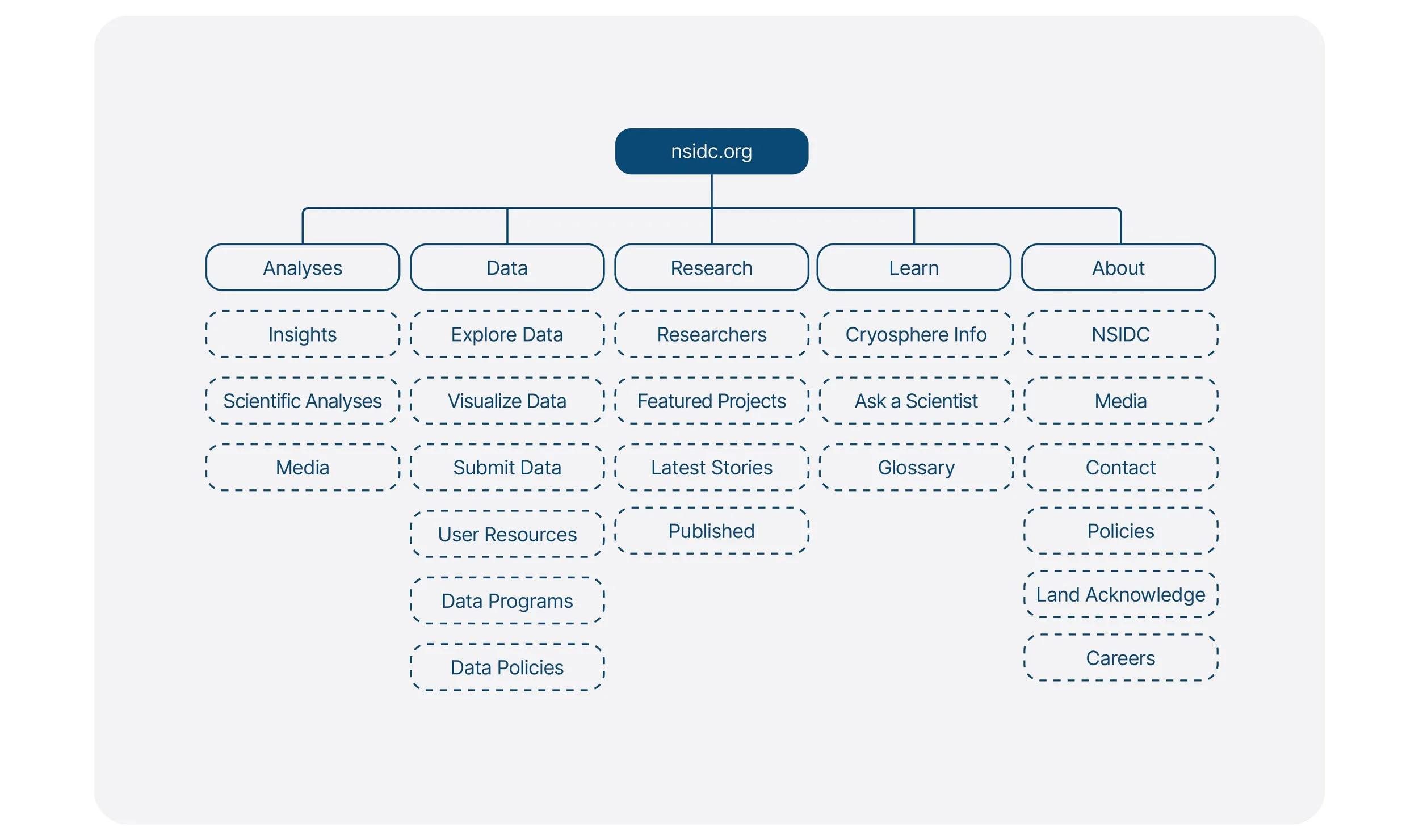
I also restructured the site’s architecture by creating a new site map. The goal was to streamline navigation and reduce the number of steps needed to find key information. I organized the site into clear sections: Research, Data, and Education, each designed to meet the distinct needs of the primary user personas. The site map simplified the user journey by grouping related content logically and ensuring that all important datasets, research tools, and resources were easy to find.
Starting the Design
We kicked off the design process by defining clear objectives based on user research and feedback. The primary goals were to simplify navigation, improve data accessibility, and create a more intuitive experience across all devices. With these priorities in mind, I sketched out a rough framework that balanced the needs of the two main personas—researchers and educators.
Lo-fi Mockups
Next, I created low-fidelity mockups to visualize the basic structure and layout of the site. These wireframes focused on the user flow and overall information architecture, helping us prioritize usability over aesthetics. I stripped away distractions, honing in on simplified navigation, easy-to-access datasets, and clean layouts that would guide users through the site. The mockups were presented to stakeholders for feedback, which guided adjustments before moving to higher fidelity designs.
Style Guide
To maintain consistency across the redesigned site, I developed a comprehensive style guide. This guide outlined the color palette, typography, icons, button styles, and layout rules to create a cohesive visual identity. Drawing from NSIDC’s scientific focus, I used a cool, minimal color scheme that reflected the site's snow and ice theme. The style guide ensured that both the design and user interface remained consistent across all pages and future updates.
Hi-fidelity Prototype
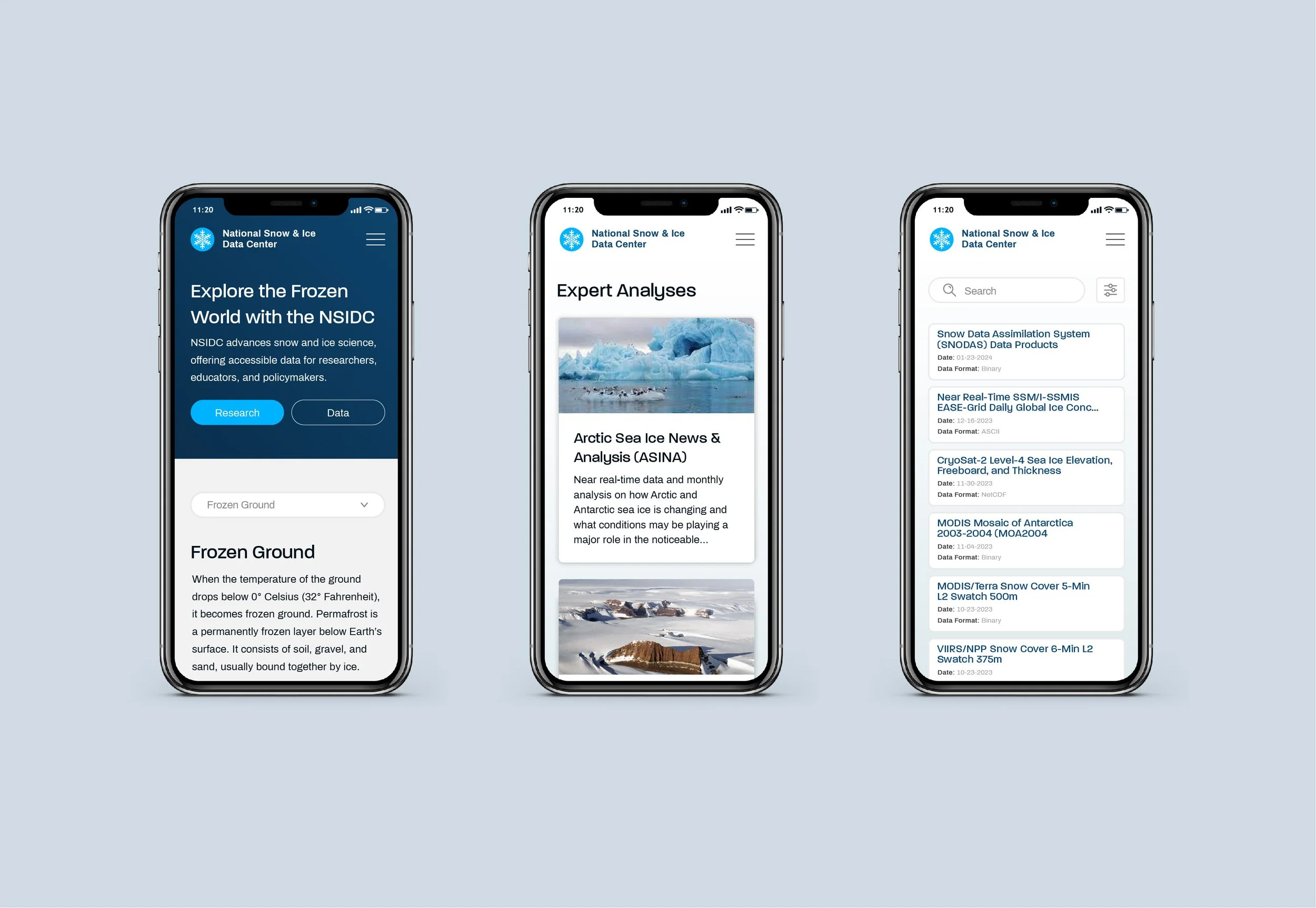
Once the design was refined and the core functionality established, I moved on to creating the high-fidelity prototype. This prototype included all visual elements, interaction details, and final content layouts, bringing the design closer to the end-user experience. It featured polished UI components such as responsive navigation, interactive data visualizations, and improved search capabilities. The prototype was designed to closely simulate the live site, allowing stakeholders and users to interact with it and provide final feedback. Usability testing during this phase focused on ensuring that the design was intuitive, responsive, and fully accessible across devices.
Conclusion
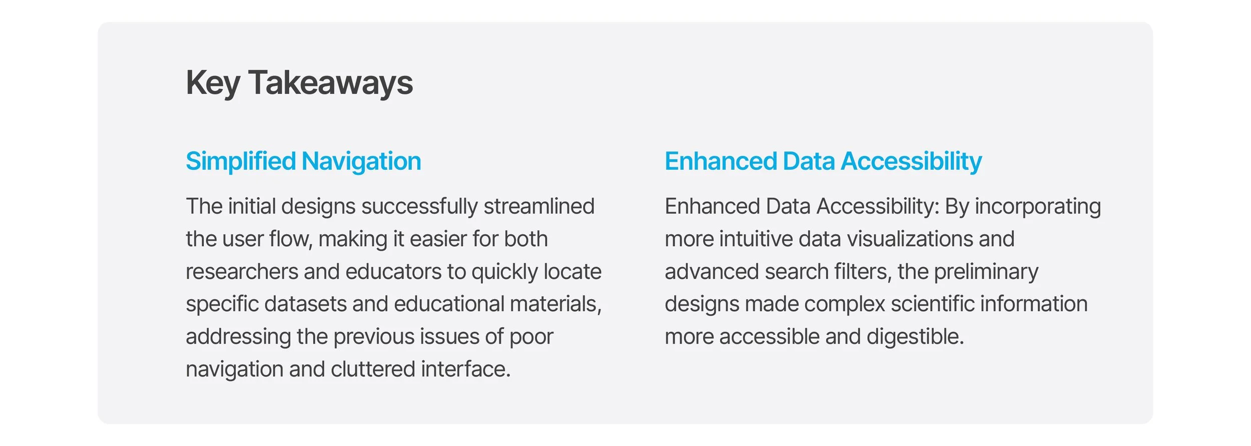
The redesign of the NSIDC website transformed it into a user-friendly, accessible platform that caters to its diverse user base. By focusing on simplified navigation, enhanced search capabilities, and improved data visualization, the NSIDC is now better equipped to support its mission of providing accessible snow and ice data to the global community.


